Table of contents (9)
- Q1. Does graphic design actually move e-commerce sales, or is it a vibes purchase?
- Q2. Where does graphic design have the biggest sales impact?
- Q3. What does a conversion-optimized product detail page actually look like?
- Q4. Product photography vs. illustration vs. 3D renders: what should you use when?
- Q5. What are the mobile-first design rules for e-commerce in 2026?
- Q6. How does brand consistency across surfaces move conversion?
- Q7. How do you hire the graphic and product design talent that actually moves e-commerce sales?
- FAQs
- Ready to hire e-commerce design talent?
The Impact of Digital Graphic Design on E-Commerce and Product Sales

How graphic design moves e-commerce revenue on PDPs, checkout, and post-purchase. Data + hiring playbook for designers who actually lift conversion.
Digital graphic design is one of the last unmeasured budget lines in most e-commerce teams. Founders will A/B test every checkout button and every discount rate but keep buying visual work on vibes, not data. The truth is that graphic design has quantifiable, compounding effects on product-page conversion, add-to-cart rates, cart recovery, and post-purchase loyalty, and the effects are large enough that a design engagement that costs $8,000 to $30,000 often returns 20% to 60% conversion lift in the first two quarters. This piece maps every place design touches the sale, gives you the ranges by category, and hands you a hiring playbook for the graphic and product designers who actually move revenue.
TL;DR. Graphic design moves e-commerce revenue in five places: the product-detail page hero, the product gallery, the add-to-cart interaction, the checkout visual system, and the post-purchase email and pack-in design. Product photography lifts conversion 20% to 40% over stock or renders. A consistent visual system across ads, PDP, and checkout lifts add-to-cart rates 15% to 30%. Mobile-first design is now table stakes (73% of e-commerce traffic and 61% of orders come from mobile in 2026). Most brands under-invest here because the ROI is easier to attribute to ads. The playbook: hire a graphic designer who has built a full e-commerce visual system before, brief them against your funnel data, not your Pinterest board, and instrument the ship.
Q1. Does graphic design actually move e-commerce sales, or is it a vibes purchase?
Graphic design is the single most under-measured lever in most e-commerce teams, and the reason is that its effects show up two or three steps downstream from where the design work happened. A hero image change lifts click-through on a paid ad by 8%, then lifts add-to-cart on the product page by 12%, then reduces cart abandonment by 3%. Nobody attributes the checkout revenue to the hero image, but the compounding is real and it is measurable if you instrument it.
Baymard Institute's ongoing checkout benchmarks put the average large e-commerce site's checkout usability at roughly 62 out of 100 in 2025, with the biggest score losses coming from visual hierarchy, form design, and error handling. Design work on those three areas is the reason the top-decile sites convert twice as well as the median at similar traffic volumes. The industry pattern is stark: sites in the top 10% of checkout design convert 3.5% to 5.5% end-to-end while the median sits at 1.8% to 2.2%. Most of that gap is design, not tech.
The second reason design is under-measured is that the wins are non-linear. The first product-photography upgrade often moves conversion by 15% or 20%. The second one, if it targets the second-highest-traffic PDP, moves it another 8%. By the fifth or sixth iteration, the marginal lift shrinks to 1% or 2%. Most teams stop iterating too early because the diminishing returns look like the design is not working, when in fact the first three iterations were building the compounding base for everything downstream. If you want the deeper theory on how design compounds through the funnel, our companion piece on how digital design services improve UX and conversion rates breaks down the four-lever model in detail.
The third reason design is under-measured is that the marketing team owns the ad creative, the product team owns the PDP, and the ops team owns the checkout and post-purchase, so the visual system fragments across owners and nobody sees the whole picture. When a brand consolidates the visual system across all three surfaces, conversion typically lifts 15% to 30% within a quarter, and the lift is durable because it also reduces bounce and improves brand recall on return visits.
Q2. Where does graphic design have the biggest sales impact?
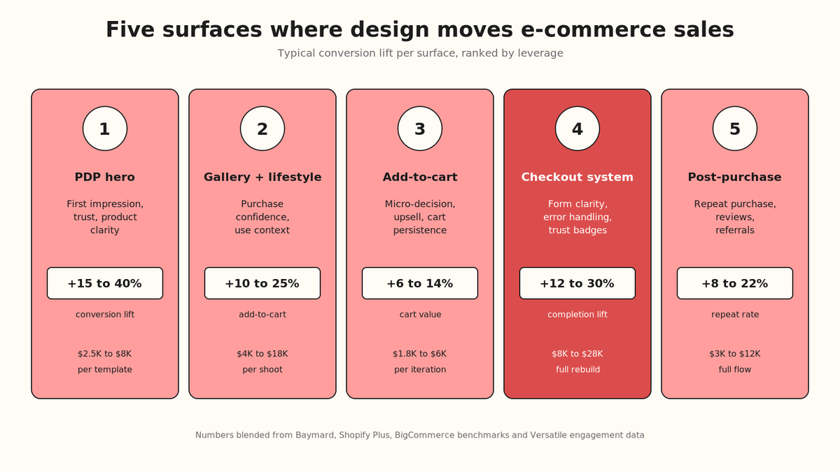
There are five surfaces where graphic design is doing real revenue work, and their leverage is roughly ordered. If your team is choosing where to invest first, start at the top of this list.
| Surface | What design changes | Typical conversion lift | Cost band to redesign |
| Product-detail page hero | First-impression trust, product clarity, price legibility | 15% to 40% | $2,500 to $8,000 per template |
| Product gallery and lifestyle imagery | Purchase confidence, size and scale communication, use-case recognition | 10% to 25% add-to-cart lift | $4,000 to $18,000 per shoot |
| Add-to-cart interaction and mini-cart | Micro-decision moment, upsell placement, cart persistence | 6% to 14% cart-value lift | $1,800 to $6,000 per iteration |
| Checkout visual system | Form clarity, error handling, trust density (badges, guarantees, review counts) | 12% to 30% checkout-completion lift | $8,000 to $28,000 for a full rebuild |
| Post-purchase email and unboxing | Repeat-purchase rate, review submission, referral | 8% to 22% repeat-purchase lift over 90 days | $3,000 to $12,000 for the full flow |
The pattern is that the earlier in the buyer's journey a design element sits, the wider the funnel it affects, and the smaller each individual conversion lift looks. A better ad creative moves click-through, and click-through cascades into every metric downstream, but nobody credits the ad creative with the eventual repeat purchase. A better checkout button moves only checkout, but the attribution is direct, so the checkout button feels like a bigger win. Both are real. Both compound. If you have to pick, pick the surface with the biggest current leak, not the one with the cleanest attribution. Teams that want a structured way to run this prioritization can borrow the framework in our writeup on A/B testing in design for isolating which element on which surface is doing the actual work.
"We spent nine months A/B testing button colors on our PDP and lifted conversion by 1.4%. Then we replaced the entire hero image set with lifestyle photography that showed the product in use and conversion moved 23% in six weeks. Everything we had done for nine months was tuning a system that had a broken foundation."
— Head of E-commerce, DTC apparel brand Shopify - G2 Verified Review
Q3. What does a conversion-optimized product detail page actually look like?
The product detail page is where most e-commerce brands make or lose the sale, and the design pattern for a page that converts has been stable for about five years. The variations are cosmetic; the anatomy is not.
Above the fold, on desktop, you need five things visible without scroll: a primary product image large enough to see the surface texture, a product title in a legible weight that reads as the product name (not a marketing tagline), a price with the currency and any strike-through in place, an add-to-cart button in a color that contrasts with the background at 4.5:1 minimum, and at least one trust signal (review count, verified badge, or shipping guarantee). Anything else pushed into the fold is decoration and reduces conversion.
Below the fold, the sequence that converts is: expanded gallery, size and variant selectors, delivery and returns info, detailed description, reviews, and cross-sell. Every deviation from that sequence has a reason to justify itself against a baseline. Most brands that reshuffle this order do it for design aesthetics rather than data, and they pay for it in conversion.
On mobile, the fold is smaller and the discipline is harder. The product image occupies more vertical space, the add-to-cart needs to remain thumb-accessible even after scroll (so a sticky CTA is nearly always correct), and the price and trust signal need to be readable at 4mm height at arm's length. Any text under 16px is unreadable in daylight on a mid-tier Android device, which is what 40% of your Southeast Asian, Latin American, and Indian buyers are using. If your PDP still uses 12px or 14px body copy anywhere, mobile conversion is being taxed for no reason. For teams building this from scratch, our writeup on hiring a UI/UX designer for e-commerce covers exactly what to look for in a portfolio, and our roundup of the top platforms to hire e-commerce design freelancers is useful when the work is a one-off PDP fix rather than a full retainer.
"We spent six months tuning our desktop PDP layout because that is where our design team worked. Then we saw the analytics: 71% of our traffic was mobile and our mobile PDP was a bad shrunken version of the desktop. We rebuilt mobile-first over eight weeks and mobile conversion moved 34%. Desktop moved 6% as a happy side-effect. Every hour we spent on desktop-first was compounding in the wrong direction."
— Head of Product, footwear DTC brand Shopify Plus - G2 Verified Review
The single highest-leverage detail on a PDP is the primary image quality. Not the count of images, not the zoom function, not the 360 rotator. The primary. A single photograph shot with proper lighting, on the product's actual surface, at the right distance and angle, outperforms a slick 3D render on almost every product category outside furniture and jewelry. Baymard's usability testing has shown this consistently for a decade, and the pattern has held through every visual trend cycle.
Q4. Product photography vs. illustration vs. 3D renders: what should you use when?
The choice of visual medium is one of the two or three most consequential design decisions an e-commerce brand makes, and it tends to be made once at brand founding and never revisited. That is a mistake. The medium should be chosen per product category, per surface, and sometimes per audience segment.
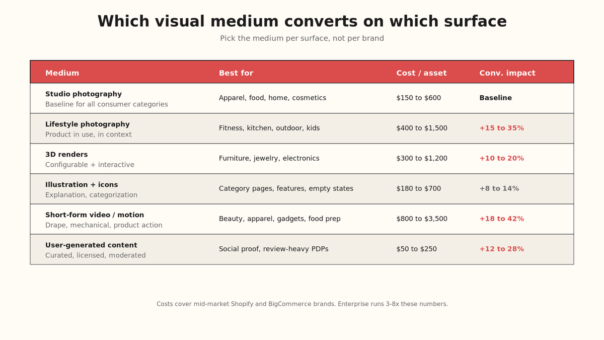
| Medium | Best for | Cost per asset | Conversion impact vs baseline |
| Studio product photography | Apparel, accessories, food, cosmetics, home goods, most consumer categories | $150 to $600 per SKU | Baseline (this is what buyers expect) |
| Lifestyle and in-use photography | Any product where use context matters (fitness, kitchen, outdoor, kids) | $400 to $1,500 per scene | +15% to +35% add-to-cart when replacing studio-only sets |
| 3D product renders | Furniture, jewelry, electronics, custom-configurable products | $300 to $1,200 per model | +10% to +20% for configurable categories; neutral for standard |
| Illustration and iconography | Category pages, feature callouts, empty states, education content | $180 to $700 per illustration | Rarely moves PDP conversion; +8% to +14% on category-page dwell time |
| Short-form video (loops, product motion) | Beauty, apparel drape, gadgets with mechanical action, food prep | $800 to $3,500 per SKU | +18% to +42% engagement; +6% to +16% conversion |
| User-generated content (curated) | Social proof placement, review pages, secondary galleries | $50 to $250 per asset (licensing) | +12% to +28% trust density lift on review-heavy PDPs |
The failure pattern is choosing one medium and forcing every surface through it. A brand that shoots gorgeous studio product photography and then uses the same images in social ads, on the PDP, in the shopping-feed thumbnails, and in email is losing conversion at every surface because each surface has different visual requirements. Studio product works on PDP; lifestyle works in social; motion works in shopping feeds; UGC works in reviews and cart-abandonment email. A visual system that respects the surface converts at every stage.
The most important secondary decision is how your imagery handles negative space. A product photographed with 20% to 40% of the frame as clean, single-color negative space allows the product to be cropped, resized, and composed into any other layout without a redo. Product shot edge-to-edge cannot be re-used anywhere else and forces you to reshoot for every new surface, which triples your annual photography spend. Our breakdown on the five digital design services that boost social media presence covers this reuse pattern in more detail for teams optimizing for cross-channel visual efficiency.
"The single biggest change we made in year two was shooting every product with 30% negative space on the left and right. It felt wasteful at the time. It cut our annual photography spend by 40% the following year because we could reuse everything across web, email, paid social, and retail signage without touching a photographer again."
— Creative Director, home goods brand Adobe Creative Cloud - G2 Verified Review
Q5. What are the mobile-first design rules for e-commerce in 2026?
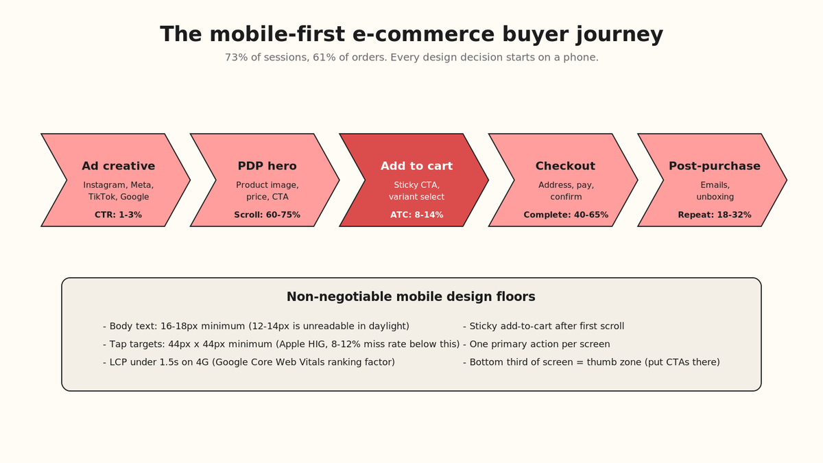
Mobile is not a subset of your e-commerce design work anymore, it is the whole thing. Statista's e-commerce traffic data has mobile at 73% of sessions and 61% of completed orders through 2025, with mobile-order share still climbing at 3% to 4% year over year. If your design process still starts on desktop and adapts down, your brand is losing conversion on the surface that owns two-thirds of your revenue.
The mobile-first rules that reliably lift conversion are unglamorous:
- Body text at 16px or 18px minimum. Anything smaller is unreadable in daylight and forces the user to pinch and zoom, which breaks the interaction pattern and doubles the drop-off rate at the exact moment they were considering the purchase.
- Tap targets at 44px x 44px minimum. Apple's Human Interface Guidelines have used this floor for a decade for a reason. Buttons smaller than this are missed 8% to 12% of the time on the first tap, and every missed tap is a friction event that compounds through the funnel.
- Product image loads in under 1.5 seconds on 4G. Google's Core Web Vitals now treats Largest Contentful Paint as a ranking factor for both organic and paid placement. A hero image that loads in 3.5 seconds costs you both traffic and conversion.
- Sticky add-to-cart after the first scroll. On mobile, the add-to-cart button disappears above the fold within one thumb swipe. A sticky version at the bottom of the viewport recovers 8% to 15% of the cart adds that would otherwise require a scroll back up.
- One primary action per screen. Every additional call-to-action on a mobile screen reduces the primary action's conversion by roughly the same percentage as the secondary action steals. If you have three CTAs on your PDP, your add-to-cart is losing 15% to 30% of its potential clicks to the other two.
The other mobile rule that most brands miss is that thumb reach matters. The bottom third of a mobile screen is where a right-handed user's thumb naturally rests, which is why the sticky cart button belongs there. Text-heavy blocks and navigation menus belong in the top third, where the eye tracks first but the thumb rarely needs to press. The middle third is the product zone, images, price, variants. Violating this pattern is what makes some e-commerce apps feel intuitive and others feel awkward, and the difference is entirely design, not tech. Our companion post on mobile-first design as a full framework goes deeper into the layout mechanics for teams building or rebuilding from scratch.
Q6. How does brand consistency across surfaces move conversion?
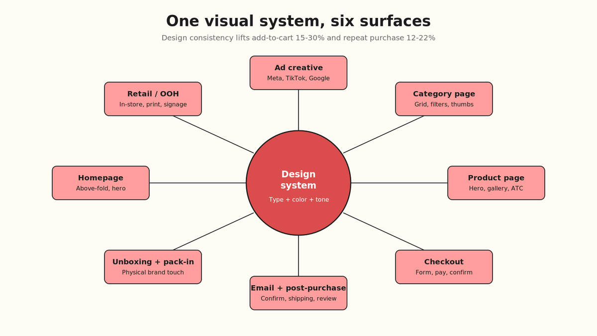
Brand consistency is the least glamorous design work and the one with the most durable ROI. A shopper who sees your product in an Instagram ad, clicks through to your PDP, adds to cart, receives a confirmation email, and gets a shipping notification is going through five different design surfaces, and every jarring visual break in that sequence measurably reduces trust and repeat purchase.
The elements that need to be consistent across surfaces are: typography (two typefaces maximum, one for headings, one for body), color system (four to seven colors including at least one primary CTA color and one destructive-action color), product-image treatment (backgrounds, crops, lighting), tone of voice in copy, and CTA button style. Everything else can vary by surface and should, because a checkout page and an Instagram ad have different jobs and need different layouts.
The measurable effect of a consolidated visual system is roughly 15% to 30% lift in add-to-cart rate when the ad creative and the PDP visually match, and a similar-magnitude reduction in bounce rate when the confirmation email visually matches the checkout. Neither of these is a headline number that shows up in the marketing dashboard, which is why the work rarely gets prioritized, but both compound with every campaign you run and are the reason mature DTC brands out-convert scrappy DTC brands 2x on the same ad spend. Teams looking to formalize this into a repeatable playbook should read our post on the innovative trends shaping the future of product design services, which covers the design-system-as-competitive-moat framing.
The design artifact that makes this consistency actually happen is a design system, sometimes called a brand system or a visual guidelines document. It is a working file (typically in Figma) that defines every reusable component, every color token, every typography style, and every image treatment rule. A design system takes 3 to 6 weeks to build for a mid-market e-commerce brand and pays for itself within the first cross-channel campaign that ships without needing net-new asset production. If you are hiring a designer to build one, our breakdown on design systems tuned to different user personas covers the persona-mapping layer that most templates skip.
"Our design system project felt like a distraction for the first month. Then we ran a Black Friday campaign that produced 40 asset variations across 6 channels in two weeks with one designer, when the previous year the same volume of work had needed a team of four for six weeks. The system paid for itself in one campaign cycle."
— Head of Brand, mid-market Shopify Plus brand Figma - G2 Verified Review
Q7. How do you hire the graphic and product design talent that actually moves e-commerce sales?
The hardest part of investing in e-commerce design is that the design talent market is enormous and mostly not built for e-commerce. Most graphic designers are trained for print, brand, or general digital work; most product designers are trained for SaaS or consumer apps. E-commerce is a specialization inside both, and the specialists are worth paying up for.
The three signals that separate an e-commerce design specialist from a generalist are: they have shipped work on a live Shopify, BigCommerce, WooCommerce, or Magento storefront and can point to the metrics, they understand the difference between a PDP hero image and a category-page thumbnail and design each with the surface in mind, and they can talk fluently about checkout usability, cart persistence, and post-purchase email flows without prompting. Any candidate who cannot cover all three is a generalist you are hoping will learn on your budget, which sometimes works and often does not. If you are running the interview yourself, the portfolio-review scorecard in how to hire the perfect SaaS designer transfers cleanly to e-commerce design hires with two or three category-specific tweaks.
| Hiring model | Best for | Typical cost (annual or engagement) | Time to first ship |
| Solo freelancer (regional) | One-off PDP redesign, seasonal campaign, single-channel asset packs | $80 to $220 per hour; $3,500 to $12,000 per project | 1 to 3 weeks |
| Boutique e-commerce design agency | Full visual-system rebuild, PDP-to-checkout redesign, launch of a new brand | $18,000 to $90,000 per engagement | 3 to 6 weeks |
| In-house designer (US or UK) | Steady-state design ownership, brand stewardship, ongoing campaign work | $95,000 to $165,000 fully loaded per year | 10 to 16 weeks to hire |
| India-based dedicated designer (via EOR or partner) | Same as in-house but 65% to 80% cost reduction; strong for teams that want ownership without US in-house overhead | $26,000 to $52,000 fully loaded per year | 3 to 6 weeks to hire |
| Global platform hires (Toptal, Braintrust, contra) | Vetted contractors for defined-scope projects; useful when the internal team is stretched | $95 to $250 per hour; project-scoped | 1 to 4 weeks to match |
The pattern for mid-market e-commerce brands scaling past $5M in annual revenue is a hybrid: one senior in-house design lead who owns the system and briefs the work, plus a stable of specialists (photographer, motion designer, illustrator, sometimes an offshore product designer for PDP and checkout work) engaged on a retainer or contract basis. This structure gives you the design authority of in-house without the fixed cost of a full in-house team, and it scales cleanly as the brand grows. For a fuller mental model on when to use each hiring shape, our post on outsourcing talent for startups walks through the same decision tree with the operational tradeoffs made explicit.
For teams looking at India specifically, the design talent pool has matured substantially over the past four years. Bengaluru, Pune, and Delhi NCR now have deep benches of senior product and graphic designers with 6 to 12 years of shipped work at ex-Flipkart, ex-Myntra, ex-Nykaa, ex-Meesho, and ex-BigBasket stripes. The salary bands are in our detailed writeup on the cost of hiring a designer in Bengaluru and the fully-loaded cost of hiring in India. If you have never hired an offshore designer before, our guide on how to hire top UX designers covers the portfolio-vetting and trial-project framework that reduces the misfire rate on remote hires from roughly 40% to under 15%.
"We had cycled through three US-based e-commerce design freelancers in eighteen months and none of them shipped a full redesign inside the retainer. The India-based team we hired next shipped a full PDP-to-checkout redesign in six weeks for less than one quarter of what we had already paid the previous three combined. Time zone required scheduling discipline. Nothing else did."
— Founder, DTC food brand Canva - G2 Verified Review
FAQs
How much should a mid-market e-commerce brand spend on graphic design annually?
A mid-market Shopify or BigCommerce brand doing $2M to $15M in annual revenue typically spends 2% to 5% of revenue on design and creative production, or roughly $40,000 to $750,000 depending on the shape of the work. Brands that are heavily campaign-driven (fashion, beauty, home) sit at the top of that range; brands with a narrow SKU set and stable creative sit at the bottom. If your design spend is under 1% of revenue and your conversion has been flat for two quarters, design is almost certainly the constraint.
How do I measure whether a design change actually moved conversion?
Instrument the surface before you ship, run the change for at least two full weeks after ship, and compare against a matched two-week baseline before the change. For material redesigns, run an A/B split for four weeks. Never rely on a before-and-after screenshot as evidence, because seasonality, ad spend, and traffic mix will confound anything shorter than a proper measurement window. Any vendor who cannot help you set up the measurement is running a visual project.
Is generative AI imagery good enough to replace product photography?
Not yet for primary PDP hero images in most consumer categories. Generative imagery still struggles with fine surface texture, accurate scale, and product-specific detail, and buyers can detect the difference in usability testing at rates above 60% for apparel, food, and cosmetics. It is genuinely useful for background compositing, lifestyle scene generation as a starting point for a photographer, and social-ad variations at scale. Treat it as a productivity tool, not a photography replacement, for the next 18 to 24 months.
Do design trends actually matter for conversion, or should I ignore them?
Trends matter when they align with a usability improvement (larger tap targets, bigger body text, sticky mobile CTAs are all "trends" that also convert better). Trends do not matter when they are purely aesthetic (this year's color palette, the current typeface fashion, the currently-popular illustration style). The heuristic: if a trend passes a usability test with your actual users, adopt it. If it only passes a Pinterest test, skip it.
How long before a design engagement should show measurable revenue impact?
A well-scoped PDP or checkout engagement should show measurable lift within 4 to 8 weeks of ship. A full visual-system rebuild is a two-quarter payback because the compounding takes a full campaign cycle to show up in the numbers. Anything longer than that is either a scope problem or an instrumentation problem, and both should be raised with the vendor by the end of week four.
Ready to hire e-commerce design talent?
If you got this far, you are almost certainly evaluating either a specific design engagement or the shape of your design team for the next 12 months. We are Versatile. We place senior graphic and product designers with US, UK, and Australian e-commerce brands, and we run design engagements that ship measured conversion lift, not moodboards.
Every designer we place has a documented track record on live Shopify, BigCommerce, or WooCommerce storefronts, ships work against your funnel data (not against a Pinterest board), and comes with our team's engagement discipline for scoping, instrumenting, and measuring the design change. If the hire is durable and long-term, we run it through our own India entity as an India-native employer of record, so payroll, benefits, and statutory compliance are all handled without you setting up an Indian entity.
The fastest way to figure out if we can help is a 15-minute call. Grab a slot on my calendar or fill this quick form and I will reach out. Tell me which surface is leaking (PDP, cart, checkout, post-purchase) and what your current conversion rate is, and I will tell you inside the call whether the fix is a $9,000 sprint, a $30,000 rebuild, or a full in-house designer.
Sagar Chainani, Founder, Versatile
Ready to hire in India?
Drop your work email · we'll set up a 20-min intro call within 24 hours. Tell us what you're building; we'll tell you whether we're the right fit.
We reply in business hours (IST). Never spam, never share your email.